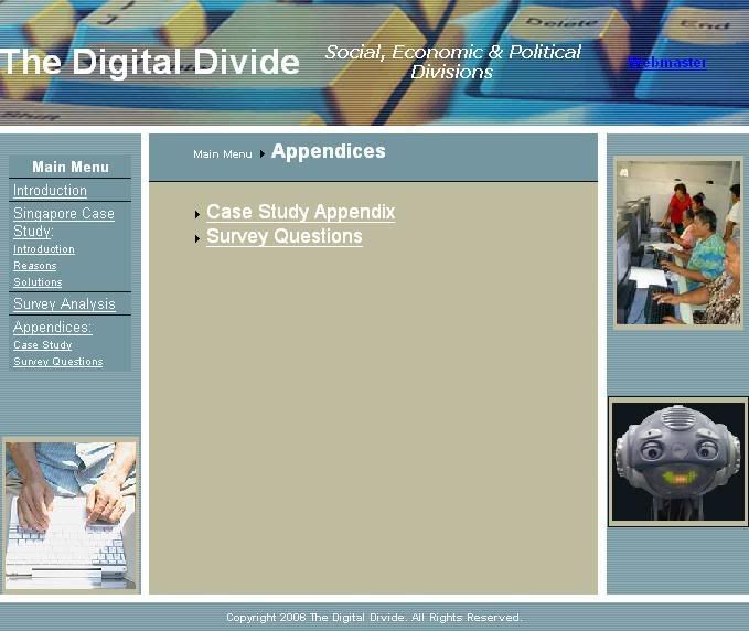
 After spending nearly 7 hours on this web-site trying to fix it's numerous glitches, I have given up. [Tada!] But the web-site is almost complete, and I've been able to paste the hard-work of my group-mates [and myself] on the numerous web pages. I must mention this project is worth 30% of our grade, so it's a big deal for us.
The research on the topic [Digital Divide] is quite informative for the unaware, so if you're interested you might want to go through that too. The web-site design is totally my work, A-Z, so I don't mind if you click on the image above to check it out, and give me some feedback.
The issues with the pages [so far] are:
1. The top bar with the title "The Digital Divide" and the placement of background images. [A major issue with most web pages.]
2. Placement of the pie chart on the Survey Analysis page. [Changes when viewed in different browsers - I tried IE and Mozilla.]
3. On the Reasons page, the footnotes that link [1] and [2] are not working properly. They're reversed, which means you go down to the footnotes, click on [1] and you're back to the top; and I can't figure out why. Neither can I understand how to fix that - my html is very out-dated.
4. I haven't even TRIED using different screen resolutions. I imagine that to be another blow-up.
5. Only two pages WITHOUT issues: the Introduction, and the Appendices pages.[Hurrah!]

No comments:
Post a Comment